Your brand guidelines are an asset, not a suggestion: here is how AI breaks them
Open the Design tab on the deck a generator has just handed you. Is your corporate theme the one selected? Very often it is not, and that single observation explains most of what follows.
You know the sequence that led there. You supplied your company's PowerPoint template, described your content, and got a deck back. At a glance it looked like your brand. The colours were roughly right. The typeface seemed correct. Then you looked closer: the title blue not quite the institutional blue, the footer gone from six slides, the logo present but very slightly stretched.
That "almost" says nothing about how clever the AI is. It is a plumbing question, and like any plumbing question it has a precise explanation and simple tests to diagnose it.
What brand guidelines actually are inside a PowerPoint file
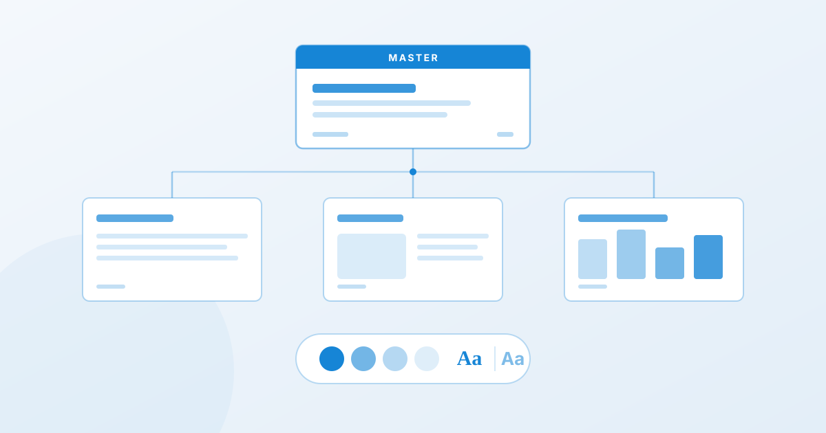
The first source of confusion: brand guidelines, inside a PPTX, are not a set of attractive slides. They are a hierarchy.
Microsoft's documentation is explicit: the slide master is the top slide in the hierarchy, and "when you edit the slide master, all slides that are based on that master will contain those changes". The hierarchy runs from the master, to the layouts, to the individual slides.
Two distinct concepts sit on top of each other, and Microsoft separates them cleanly:
- A theme is "a predefined set of colors, fonts, and visual effects that you apply to your slides for a unified, professional look".
- A template is "a theme plus some content" for a specific purpose, with its layouts, sample slides and boilerplate.
So your corporate identity lives in three places at once: in the theme (the named colours and fonts), in the master and its layouts (geometry, placeholders, footer, logo), and in the usage rules that only a human knows.
A generator can honour all three. It can also honour none of them while producing something that looks like the expected result. That gap is the source of the unease.
The four failure modes
1. Colours are hard-coded instead of referenced
The most common break, and the most invisible.
In a compliant PowerPoint file, a title is not blue. It is Accent 1, a reference to the theme. If the brand changes its blue next year, you update the theme and every presentation follows.
A generator that "reads" your template, extracts the blue value and writes it directly into each shape produces a deck that looks right today. But the link is severed. Change the theme, nothing moves. Apply the deck to another brand variant, nothing follows. You do not have a compliant presentation. You have a photograph of your compliance at one moment in time.
The visible symptom: select a title in PowerPoint, open the font colour picker, and the active colour shows up under Standard Colors or Recent Colors instead of being highlighted in the Theme Colors row.
2. Layouts are ignored in favour of free-floating text boxes
Every layout in the master contains placeholders positioned according to the brand: the title area here, the content area there. Microsoft puts it plainly: "each slide layout is set up differently, with different types of placeholders in different locations".
A generator can either fill those placeholders, or drop floating text boxes on top at approximate coordinates. Visually the second case can be indistinguishable. Functionally it destroys everything: Outline view is empty, text no longer autofits, switching layouts reorganises nothing, and accessibility (reading order) goes with it.
This is the costliest failure downstream, because it only shows when someone tries to edit the deck.
3. Fonts are substituted silently
Your guidelines mandate a corporate typeface, often licensed, often installed only on internal machines. A tool that does not have that font does what every rendering engine does: it substitutes. And it does not tell you.
The result opens correctly on your machine, because you have the font, and shifts on the recipient's, or the reverse. Differences in character width break lines, overflow titles, and nudge every block by two millimetres.
4. Master-level elements disappear
Institutional footer, slide numbering, date, classification marking, a logo positioned to the pixel: all of that lives in the master, not in the slide. A deck rebuilt outside the master loses those elements. Not everywhere, which would be easy to spot, but irregularly, which is considerably worse.
On an internal deck, that is a detail. On a document presented to a board, or submitted in an RFP response where classification marking is required, it is not.
The 30-second test
Before signing off on any generated deck, three checks settle the question.
1. Is the theme yours? Open the Design tab. Your corporate theme should be the selected one, not a renamed generic theme.
2. Is the text in placeholders? Go to View → Outline View. If the outline shows your titles and content, they are in placeholders. If the outline is empty while the slides are full, everything sits in floating text boxes and the deck has no structure.
3. Are the colours theme-linked? Select a title, open the font colour picker. The active colour should be highlighted in the Theme Colors row at the top.
Three checks, thirty seconds, and you know whether you have a compliant deck or a convincing imitation.
What to demand from a tool
"Do you support templates?" is the wrong question to put to a vendor, because everyone says yes. The useful questions are more specific:
- Do you fill my existing layouts, or do you recreate them?
- Do colours come out as theme references or as frozen values?
- What happens if my corporate font is not available on your side?
- Are the master's footer, numbering and classification preserved on 100% of slides?
- Is the exported PPTX editable in PowerPoint like any other file, or is it a flattened rendering?
That last question is a good filter. A tool that exports slides where every element is an image, or an unstructured text box, has handed you a rendering rather than a document.
That is the axis Paul works on: starting from your corporate template (corporate fonts, palette, masters, institutional footer) rather than imposing a house style, and returning an editable PPTX. What this means on a real corporate template is set out on the corporate template use case.
The advice that holds for every tool
One Microsoft recommendation cuts across the whole subject, and it holds with or without AI: "it's a good idea to edit your slide master and layout masters before you start to create individual slides".
The logic is identical when a machine produces the slides. A clean, current template with properly defined layouts gives a good result whatever the tool. A template patched together over three years, where half the slides sit outside the master, gives a bad result everywhere, and AI will simply industrialise the existing mess.
AI did not create the brand-guidelines problem. It takes a structural problem that was already there and makes it visible, and considerably faster.
Sources
- Microsoft, What is a slide master in PowerPoint?: master → layouts → slides hierarchy, placeholders, the recommendation to edit the master first.
- Microsoft, Understand the difference between PowerPoint templates and themes: definitions of theme and template.
- Microsoft, Add color and design to your slides with Themes: what a theme contains (colours, fonts, effects).